Do you feel like your website can be doing more for your business?

Do you want more people to visit your website, learn about your business, and become customers? But how?
What content does your website need?
How should it look?
Will it help your business grow?
Should you copy what your competitors are doing?1
Making your website better for your business might seem hard, but we have some proven, research-backed advice for you and include all our sources at the bottom of this page.
We’re going to keep it simple & focus on only one page: your website homepage.
It’s the most important page on your website. We won’t worry about Google or SEO. We’ll only focus on what your customers need to feel good about buying from you.
Our goal for website homepages is easy: give potential customers all the information they need to make a decision.
A quick caveat: this method is a ‘one size fits most’ solution
Not all businesses are the same, but they still have a lot in common. This method is best for a single product or service, but can be adapted (like we did on our home page) for businesses with a broader range of offerings.
In fact, it should be adapted because no two businesses are the same. A one-size-fits-most solution is a great timesaver but you should always consider your customers’ needs and modify this as needed.
Let’s get started!
Section 1: The Hero Section
Your website homepage’s hero section is the welcome mat for your website. It’s important because it helps people know they’re in the right place.
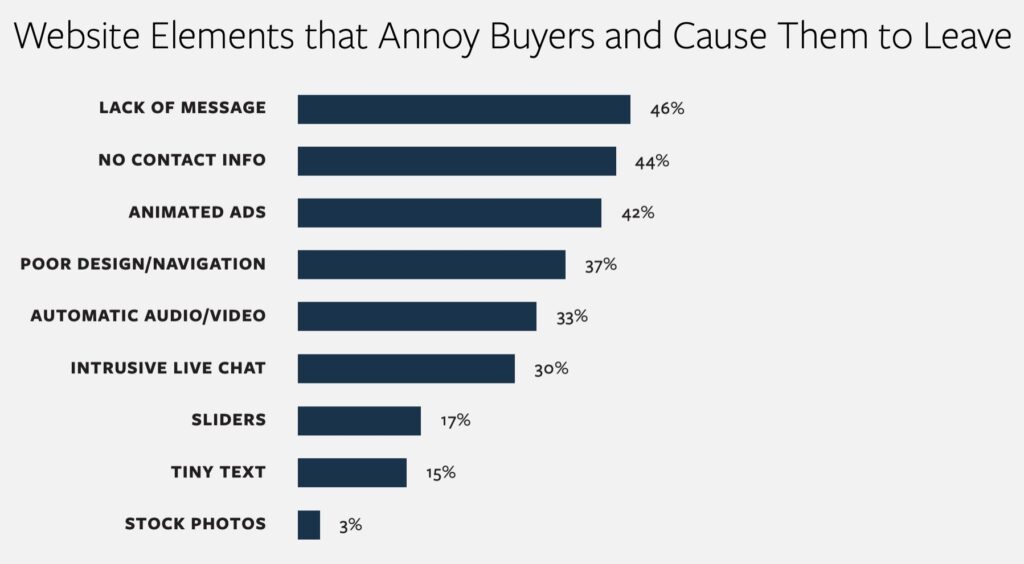
Many businesses fail at this because the #1 reason a potential customer leaves a site immediately is the lack of a message.2
‘Lack of message’ means visitors don’t understand what you can do for them.
Your hero section MUST explain what your business does FOR YOUR CUSTOMERS. Not simply what you do, or sell, or offer but what it does for them.
This helps people understand you better and qualifies them as customers.
Let’s go through each part of the hero section.
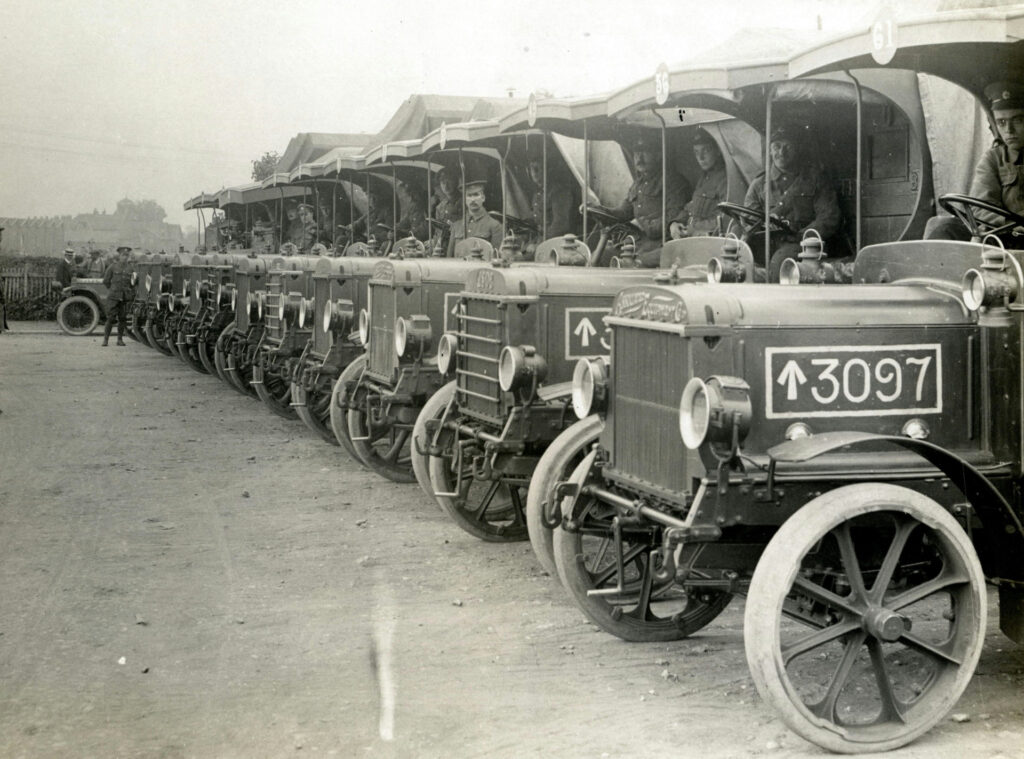
The Hero Section: Headline
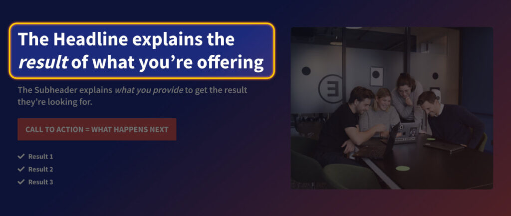
The headline should tell people what the results of your products or services are.
The headline should NOT tell people what your products or services are.
Why? Because people don’t buy products or services – they buy solutions, results or emotions.3
People don't buy clothes; they buy what happens when they wear the clothes. That could mean appearing more professional at work, fitting in with classmates, or feeling more confident.
So ask yourself What are the results my customers want? and use that to guide your headline.
The Hero Section: Subheader
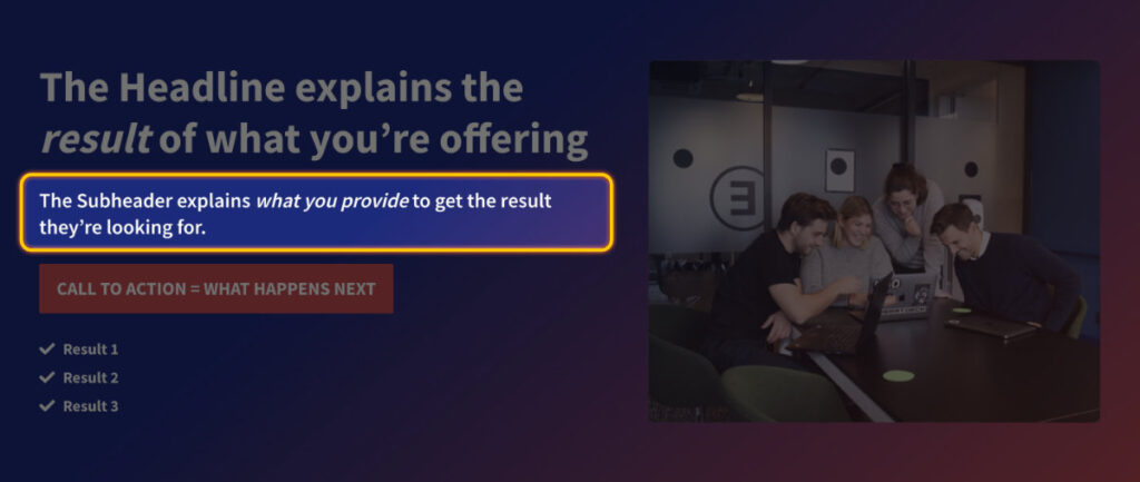
While the Headline focused on what your customers want, the Subheader explains how you deliver the results they’re looking for.
This is where you talk about what you sell or what you do, in clear and simple terms. Say what you do; make your offer.
If you’re selling pants, the headline could be about being professional or being cool, and the subheader could be about the style, design, fabric, etc.
Fixing the Headline and Subheader alone can make a HUGE improvement in how a homepage converts.
The Hero Section: Short List of More Results or Different Uses (optional)
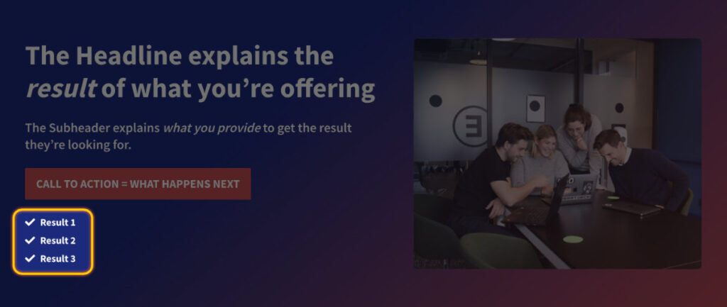
Optionally, you can add a bullet list or three checkmarks to show what more your business can do for them. Maybe you want to reinforce some different results or highlight different use cases.
By the way, when you have lists of items, stick to 3 if you can.4
Our brains can process 3 pieces of information well. And we can remember groups of 3 well too. Use this method to your advantage.
How many groups of 3 can you think of? 5
The Hero Section: Call to Action Button
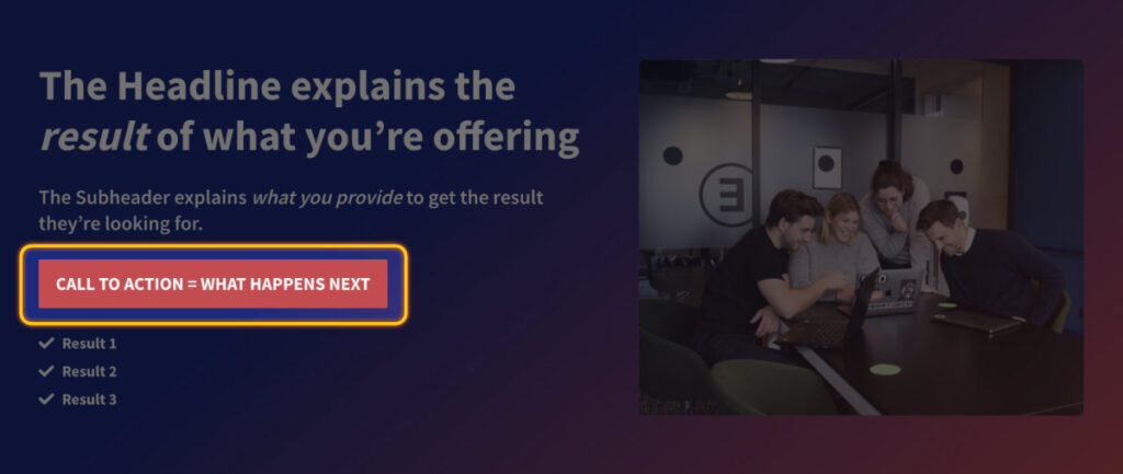
The Call to Action (CTA) button tells people what to do next.
It should not be vague, like Get In Touch. They don’t know if they want to get in touch, but they do need to know what’s the next step. What do they need to do next to get the results you’re promising?
Make your call to action clear, like Schedule a Free Estimate, Download a Check List, or Book a Call. It needs to be actionable, and it needs to be specific.
Did you notice I used the Rule of 3 twice just now?
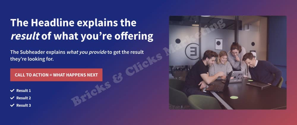
The Hero Section: Image
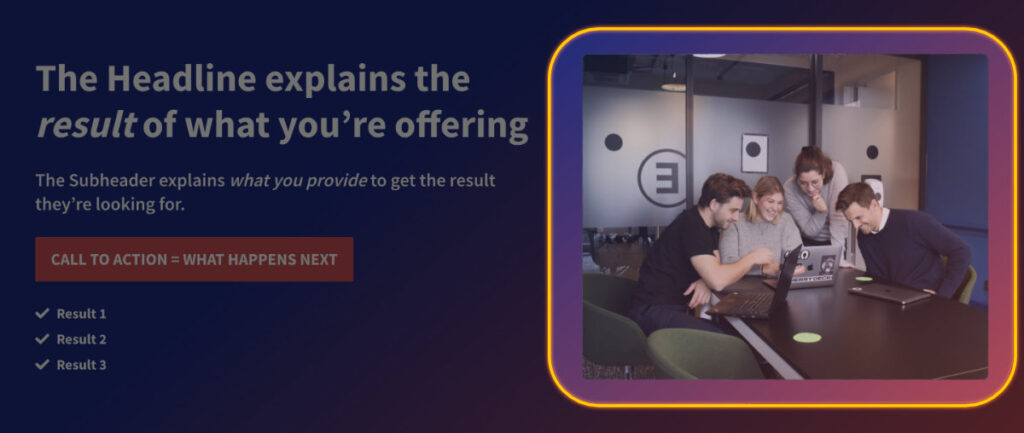
A picture is essential – but you knew that already. It’s important because visitors spend almost 6 seconds looking at the hero image.6 It might be the longest time a visitor looks at any one thing on your site so it’s critical that the image speaks to your customer’s needs.
You’ve seen what a lot of websites do: they put up an image of their office, a product, the team, the local skyline, or a stock photo of someone on a phone. The problem is, those photos don’t relate to the results or emotions your customers want.
Instead, focus on how your customer will feel after you’ve delivered the results.
Use a picture of a positive, happy person (people, couple, family, whatever makes sense for your business) that’s related in some way to what you offer. Show them how you will make them feel.
Auto mechanic sites almost always use an exterior or interior picture of their garage. But every mechanic has a garage so a picture like that does nothing more than saying 'Yes we fix cars.' It would be a lot better to use a picture of a happy customer picking up their keys or driving away.
A stock photo will work as long as it feels natural and makes sense (and if it uses real people instead of supermodels7).
Section 2: Problem/Solution
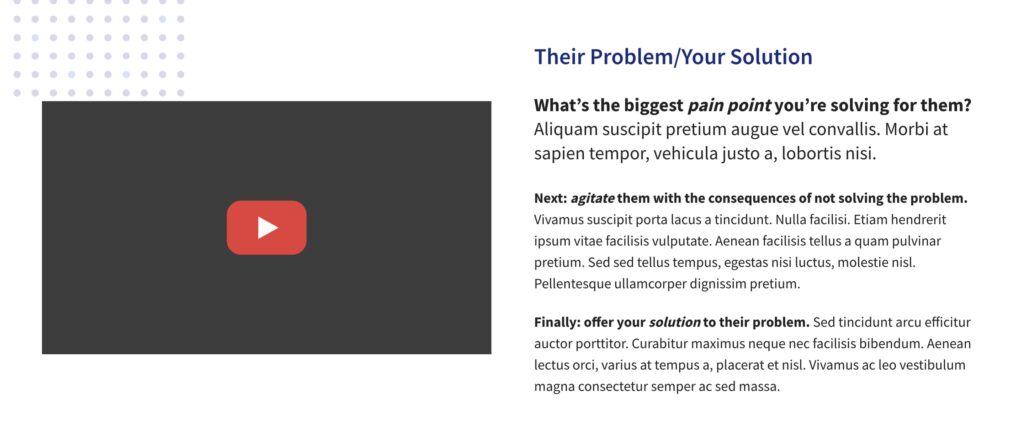
Here, you talk about the problems your business can solve in 3 short paragraphs.
We’ll do this using the tried and true Problem-Agitate-Solution copywriting formula.8 This method helps you write in a way that helps people with their problems. It has three parts:
- Problem: First, talk about the problem or what bothers your customers. It could be not having enough time or money. Think about what bothers them the most, the biggest problem your business can fix.
- Agitate: Next, make the problem seem worse by talking about what happens if it doesn’t get fixed. It could be missing out on good stuff, feeling stressed, or wasting money.
- Solution: Finally, tell them how to solve the problem, which YOU can do for them with YOUR awesome product, service, or offer.
You might notice something in the screenshot of this section above: The Problem paragraph has larger letters than the other 2 paragraphs. A study showed that when the the first paragraph of a section is bold or larger than the rest, 95% of readers will read all or part of that section.9
This section is also the ideal spot for a video. Video helps keep people on pages longer10 (which is great for SEO) and can help increase conversion rates11 (meaning more leads or sales).
If you don’t have a video, than an image that speaks to your customer’s feelings will work fine.
Section 3: Benefits
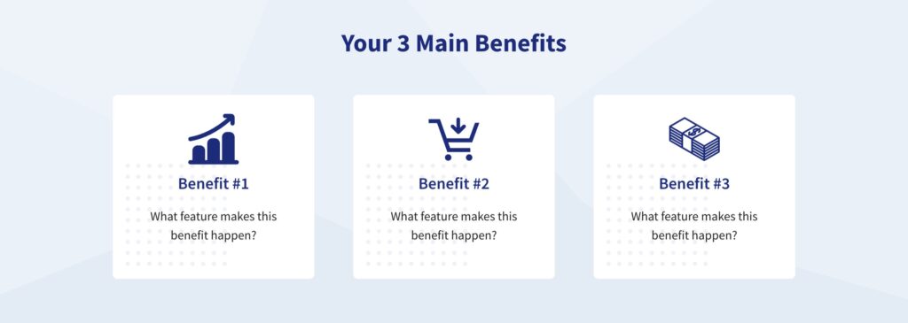
This is where you tell people the good things they can get from your business. What do you do different or better than your competitors? What makes your customers feel good?
IMPORTANT: Benefits are NOT Features. Benefits relate to the RESULTS that your customers want.
In this section you list 3 benefits in the headlines, including a photo or icon, and then mention the feature that makes the benefit possible.
Let’s talk a little bit about possibly the greatest example of a benefit ever.
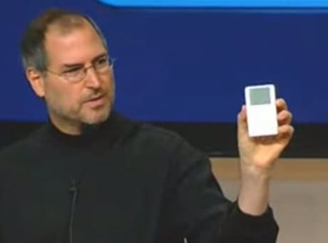
Back in 2001 there was heavy competition to sell MP3 players. There was no leader in the industry; the tech companies tried to convince people to buy their product with technical features like gigabytes of storage, size, weight, cable compatibility, yada yada yada.
It meant nothing to most people.
Then Steve Jobs flipped the industry on its head.
On October 21, 2001, he introduced the Apple iPod with a simple benefit: 1000 songs in your pocket.12
That was a Benefit that solved a major problem, and everyone understood it.
The Feature that made the Benefit possible was a 5 gigabytes hard drive.
See the difference between Benefits and Features now?
A recommendation for service-based website homepages
It might be hard to limit yourself to 3 benefits depending on the service you provide.
For a home services businesses, for example, you could adapt this into a Why Choose Us section:
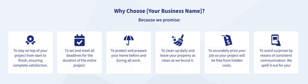
The purpose of the Benefits section is to tell potential customers of the good things you can do for them. What do you do better than your competition and how doe that make your customers feel?
Section 4: Testimonials
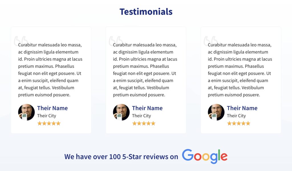
Next comes the Testimonials section, which is proof that that everything you’re claiming is true. But did you know that 72% of consumers will only take action after reading a positive review?13 That’s why it’s so important to have testimonials.
We recommend 3 testimonials (there’s that rule again) and we’re keeping them short and easily readable.
Don’t use a boring, non-specific testimonial like ‘They did a good job’ or ‘Will definitely recommend.’
Everything on this page must speak to your customers and their needs, so choose 3 testimonials that either
- Speak to one of your benefits or results that are already in the Hero or the Benefits sections
- Or help overcome a common objection
You might only use a part of a testimonial, or edit it down, but focus on either your benefits or overcoming an objection. You can still have the entire testimonial elsewhere on your website, just keep them focused and powerful here.
Be sure to include their photo, if you have permission. It’s very, very powerful if someone is willing to publicly stand behind their review.
You also want to include a 5 star graphic because everyone knows what 5 gold stars mean. If someone doesn’t read the testimonials, the 5 stars will tell them what they need to know.
Lastly, if you have a lot of great reviews on Google, Yelp, Facebook, or another review site, finish up with a line like We have over ### 5-Star reviews on [Review Site]. And use the review site’s logo as another visual cue that says a lot with a single image.
Section 5: Features
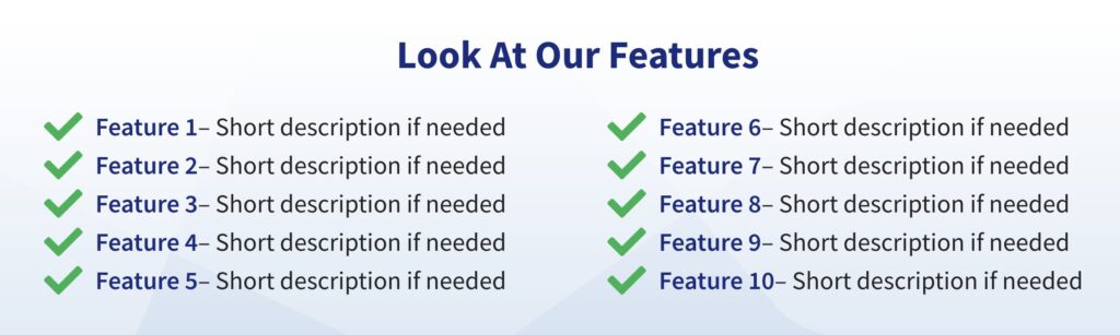
Now we list those features that most business owners are dying to tell customers about. But why, after we focused so much on emotions, benefits, and results before?
Focusing on emotions and feelings is important, because buying decisions are made based on emotion first, and THEN backed up by logic. In fact, up to 95% of the buying process is driven by emotions14, but we still have to account for the logical 5%.
The logical reasons confirm to the buyer that what they are about to buy makes sense.
This section will vary depending on what you’re offering.
If you’re selling products, list 10-20 features, like Tech Specs or other details.
If you’re selling services, you could list methods, materials, support hours, warranties, etc.
For a multiple service business like ours, the home page is too soon to delve into a lot of detaisl. So we listed various services and will leave the details to the individual service pages.
Section 6: FAQs
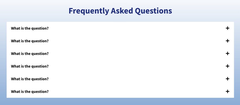
Next we need a small section of Frequently Asked Questions to proactively anwer common questions and, more importantly, common objections. Think of this section as being like a salesperson ready to respond to objections and answer questions.
Choose the 5 or 6 questions and objections that customers need answers for and post them in a Question/Answer format. Again, keep it short and to the point.
This is also a great place to provide short videos for each answer.
You’ll note that we don’t have this section on our home page because it’s not a sales page, and different services have different questions and objections. We’re saving the FAQs for the service pages.
Section 7: Call to Action

We end your business web page with a Call To Action button to tell people what to do next. We want to make it simple for them to take the next step.
Here’s how easy we’re making it for you: this is the same exact button as the one in the Hero section! There’s not need to do the work twice if it’s already been done.
That’s it – your business web page is done!
Well, that’s it for the home page, but now you have the blueprint to repeat this method on other pages, like for individual services.
By following this research-backed method, your website can bring in more customers and help your business grow, setting up a foundation for long-term success.
Sources
- Learning from competitors is good, but copying is usually a bad idea. ↩︎
- Source: https://komarketing.com/files/b2b-web-usability-report-2015.pdf ↩︎
- This is the main source for emotions but buying Results or Solutions is old marketing wisdom: https://www.psychologytoday.com/us/blog/behind-online-behavior/202108/people-dont-buy-products-or-services-they-buy-emotions ↩︎
- Source: https://blog.advesa.com/marketing/the-rule-of-three/ ↩︎
- Goldilocks and the 3 Bears. The 3 pigs. Location, location, location. “I came, I saw, I conquered.” Sun, moon, stars. Stop, drop, & roll. The list goes on, and on, and on. ↩︎
- Source: https://cxl.com/blog/10-useful-findings-about-how-people-view-websites/ ↩︎
- Source: https://cxl.com/blog/10-useful-findings-about-how-people-view-websites/ ↩︎
- Source: https://createandcopy.com/blog/copywriting-101-how-to-master-the-problem-agitate-solution-copywriting-formula ↩︎
- Source: https://cxl.com/blog/10-useful-findings-about-how-people-view-websites/ ↩︎
- Source: https://wistia.com/learn/marketing/video-time-on-page ↩︎
- Source: https://www.3playmedia.com/blog/increase-conversion-rates-video/ ↩︎
- Source: https://www.apple.com/newsroom/2001/10/23Apple-Presents-iPod/ ↩︎
- Source: https://www.searchenginewatch.com/2016/09/06/how-a-customer-reviews-strategy-can-impact-seo/ ↩︎
- Source: https://www.inc.com/logan-chierotti/harvard-professor-says-95-of-purchasing-decisions-are-subconscious.html ↩︎